A scalable design system built for a
global CPG giant, designed to power consistency
and efficiency across 40+ analytics products and initiatives.
Every dashboard looked different, making it hard to build a recognizable and
trustworthy product experience across teams.
Every dashboard looked different, making it hard to build a recognizable
and trustworthy product experience across teams.
The overview.
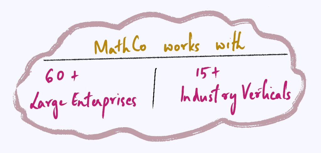
MathCo supported a global petcare and confectionary CPG client across multiple analytics initiatives, each led by different stakeholders. To ensure consistency and quality across these varied projects, we established a central design system tailored to their ecosystem.
Why the design system was needed (well ofcourse excluding the main reasons)?
Deliver consistent, high-quality products—regardless of the stakeholder or project—while streamlining internal workflows across pods.
Ensure any product delivered under this ecosystem not only looked and felt cohesive, but was immediately recognizable as a MathCo-built solution.
The Setup.
My role:
As the design systems lead on this initiative, I was responsible for setting up the foundational structure of the system, defining the visual language for analytics use cases, and establishing strong collaboration between design and engineering teams. I worked closely with Nuclios product engineers to ensure the system was not just visually consistent, but also technically scalable. My focus was on crafting principles, codifying best practices, and guiding designers across pods to adopt the system smoothly.
UX Designers across 4 product pods
Front-end engineers from the Nuclios team
Data visualization experts and dashboard developers
Client-side product owners and analysts
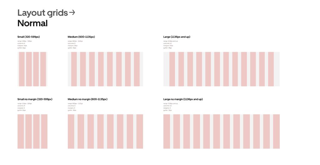
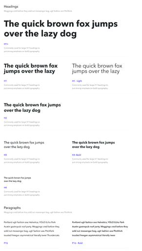
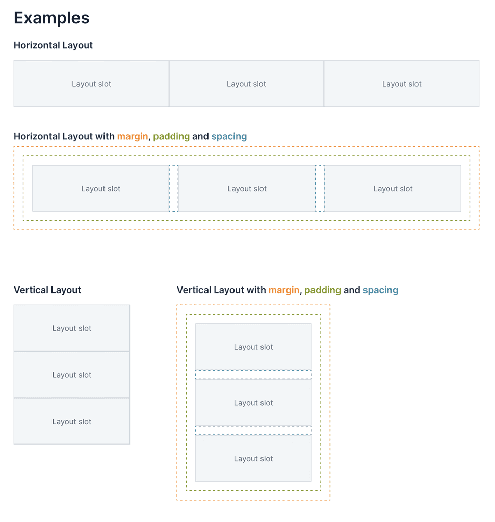
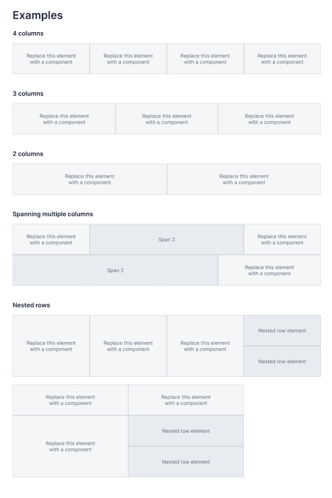
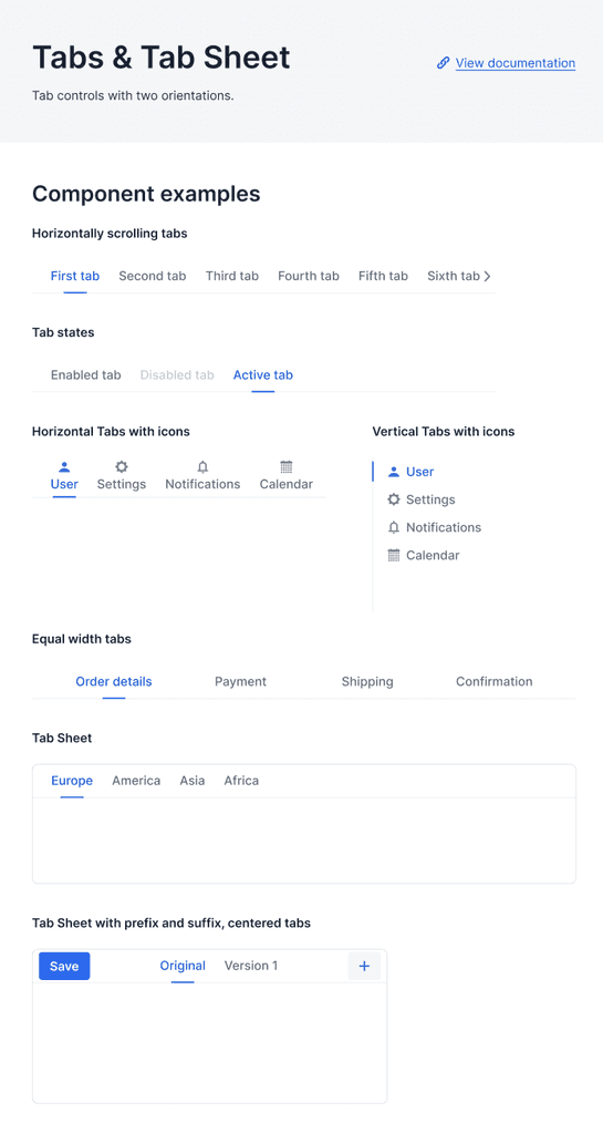
Foundation elements.
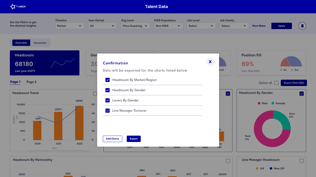
Dashboard components.
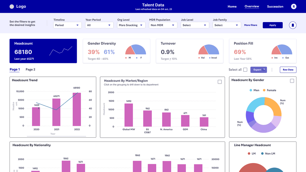
Every project wants to look at multiple numbers of KPIs. On top of that, some want to visually monitor the movement and some want straightforward numbers.
I defined a standard layout for KPI cards that highlighted the most critical metrics upfront—making it easier for users to track performance at a glance. I also designed navigation tabs to segment the dashboard into clear, meaningful views, helping users move seamlessly between different levels of analysis without getting overwhelmed. This structure made dashboards easier to scan, reduced cognitive load, and supported faster decision-making.
Visualisation Repository
Every project wants to look at multiple numbers of KPIs. On top of that, some want to visually monitor the movement and some want straightforward numbers.
I defined a standard layout for KPI cards that highlighted the most critical metrics upfront—making it easier for users to track performance at a glance. I also designed navigation tabs to segment the dashboard into clear, meaningful views, helping users move seamlessly between different levels of analysis without getting overwhelmed. This structure made dashboards easier to scan, reduced cognitive load, and supported faster decision-making.
Building the mindset.
Unlike traditional product design tools, building for Power BI came with unique limitations—it offered little flexibility in defining visual atoms, molecules, and organisms. This meant jumping straight into components wasn’t enough. The first step was ensuring we had a strong foundation for building actionable, useful, and usable analytics products—tools that users would actually trust and return to.
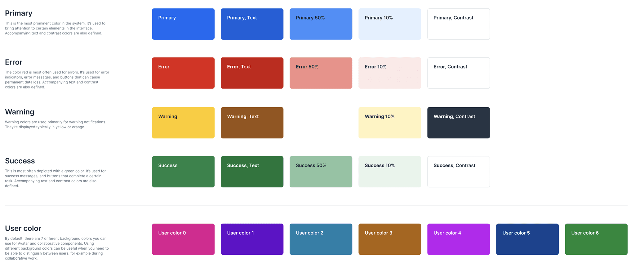
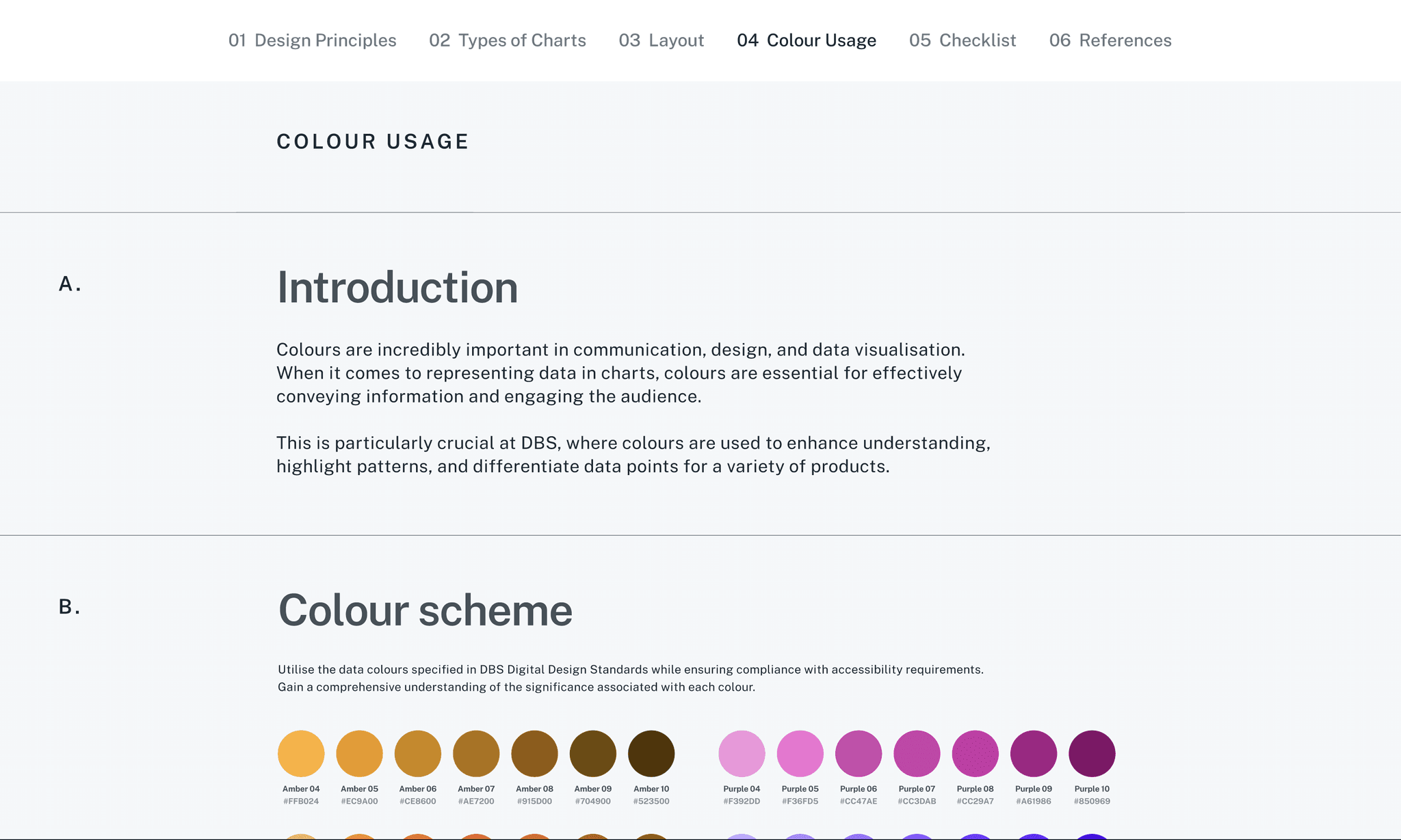
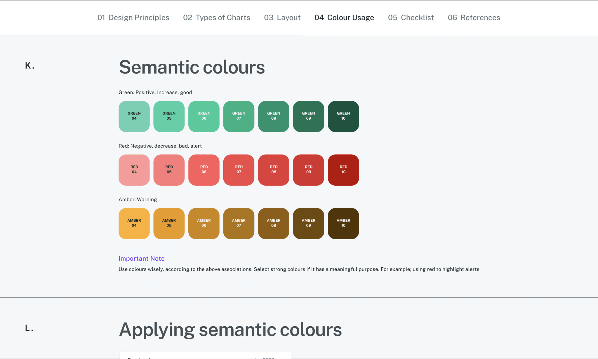
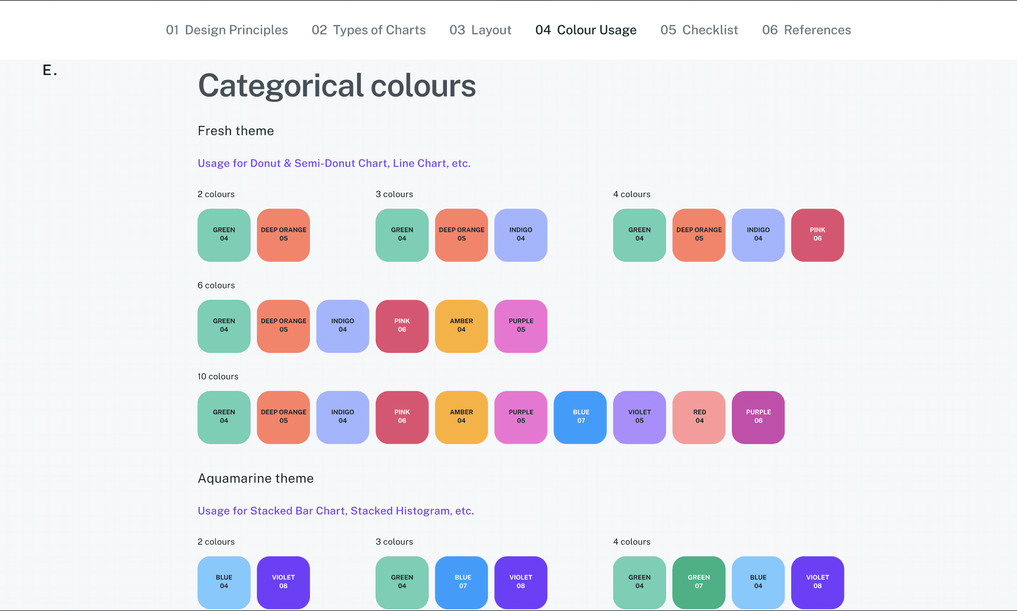
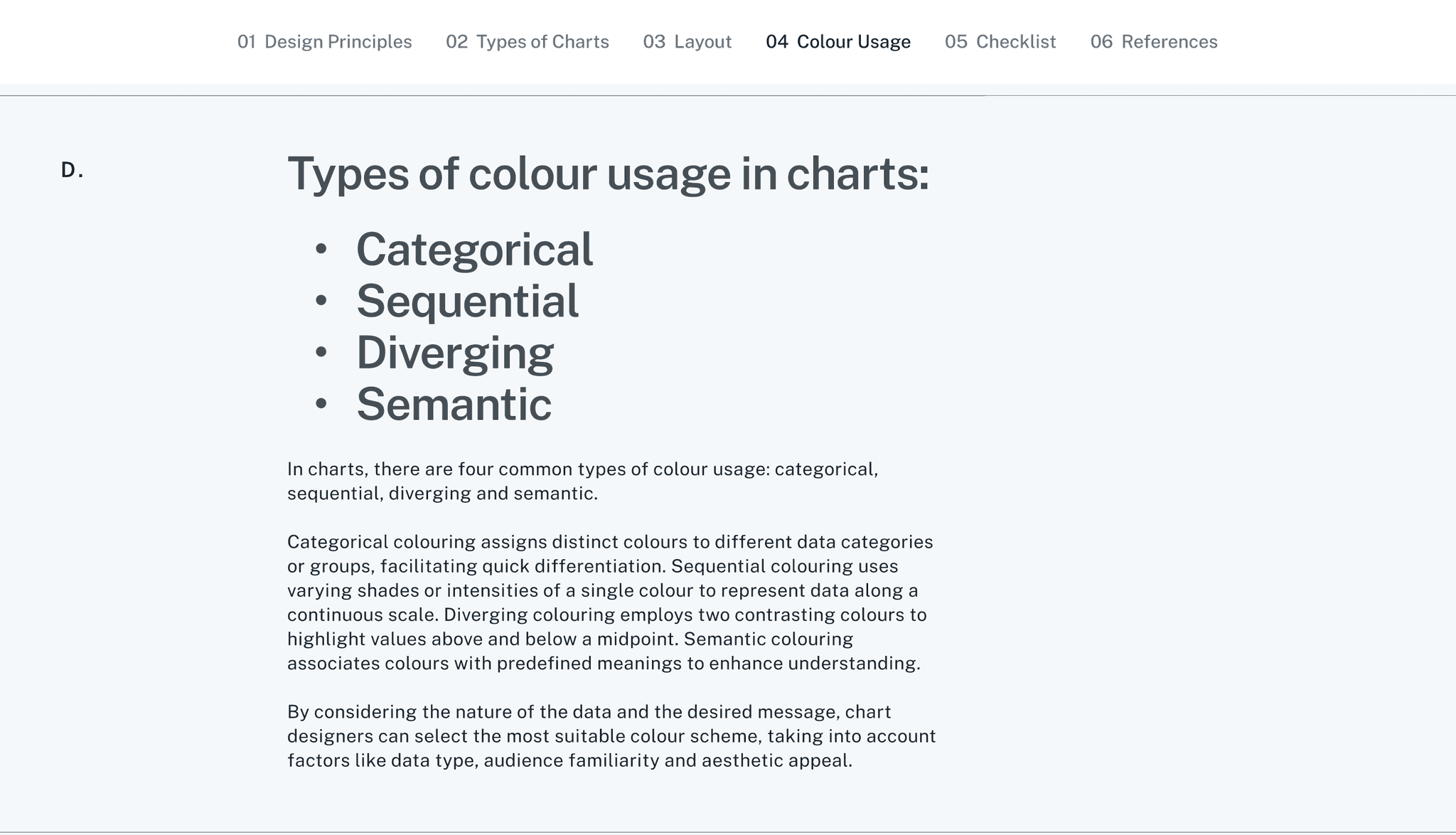
Choosing the Right Colors for the Purpose and not Preference.
In data design, color isn’t just decoration—it’s information. As one of the most powerful preattentive attributes, color helps users instantly identify patterns, spot outliers, and focus attention. That’s why choosing colors in an analytics design system required clear rules, not just good taste.
We categorized color usage based on data intent
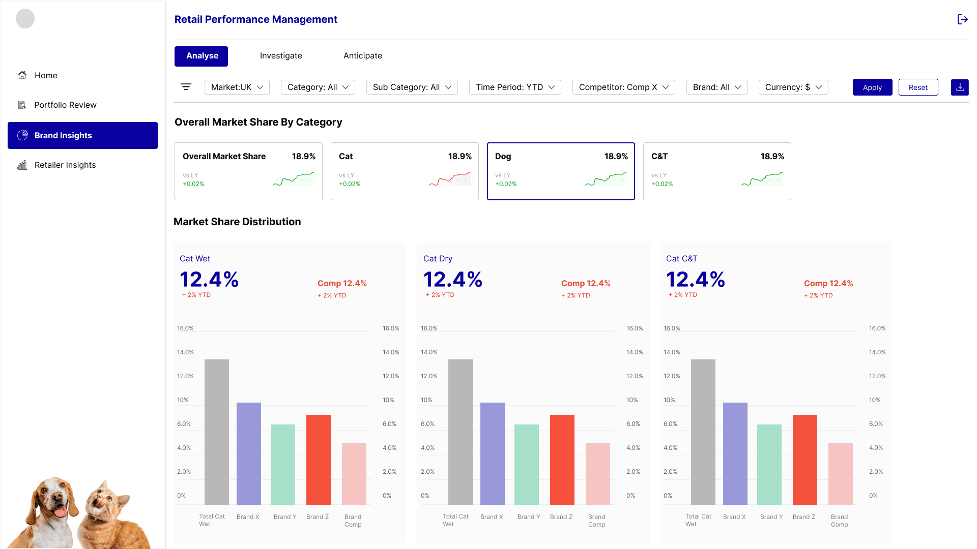
Choosing the Right Visuals for the Right Purpose.
Choosing the Right Visuals for the Right Purpose
In analytics design, the power of a dashboard lies not just in how it looks—but in how clearly it guides decisions. That’s why selecting the right visualization isn’t a matter of aesthetics, but of intention.
Before choosing a chart type, it’s critical to understand:
What kind of data is being shown? (categorical, time-series, comparisons, distributions)
What does the user need to see at a glance? (trends, outliers, patterns, breakdowns)
How should they be able to filter or slice it? (by product, geography, time, etc.)
We emphasized chart choices that didn’t just show data—but helped clarify it. For example, heatmaps for quick comparisons, slope charts to show change over time, and tree maps to highlight size vs distribution. Every visualization was tied to an insight or a decision.
The Impact.
With multiple teams at MathCo supporting the client across diverse analytics initiatives, we needed a unified design language that could scale. The design system allowed us to deliver consistent, high-quality products—regardless of the stakeholder or project—while streamlining internal workflows across pods.
It helped client teams iterate 3x times faster with us by eliminating ambiguity and standardizing components, visuals, and interactions. More importantly, it demonstrated our commitment to building scalable, future-ready solutions—enabling seamless transitions from high-level KPIs to detailed product insights.
This approach strengthened our position as a strategic partner. The client valued not just what we built, but how we built it—with scalability, usability, and governance at the core.
Final Thoughts
Every project came with its own quirks, tight deadlines, and specific business asks. But over time, we noticed a pattern—clients were starting to hesitate. Even though the data was changing, the dashboards didn’t feel new.
They’d say things like “This looks like every other dashboard we’ve seen,” or “We’re a little bored of the same layout.” And honestly, they had a point.
explore other case studies


Inconsistent design meant teams couldn’t easily reuse
components, slowing down delivery and increasing rework.